Showing posts with label color. Show all posts

Tuesday, August 27, 2013

COLOR, the basics

Hi there! This is a study break for me, while I let my brain absorb all of the acronyms and new vocabulary I have just stuffed in there. Classes started back yesterday...sort of...there was a problem with the server so only 1 of the 3 were uploaded and accessible to those of us taking online classes and HOLY EYEBALLS IS THERE A LOT OF READING IN GRAD SCHOOL.

But that has nothing to do with why we are here. We are here because of COLOR. Unless your eyeballs are also run through the television tubes of the 1950's color is EVERYWHERE. And everywhere you go it is intentional. Corporations, retail establishments and even schools are using color to affect you. You can learn to wield your very own wand of color to do your bidding once you understand how colors play together.


These are your primaries.
 That means that you can't mix them, you have to buy them
 (or mine them if you are hardcore into your art)


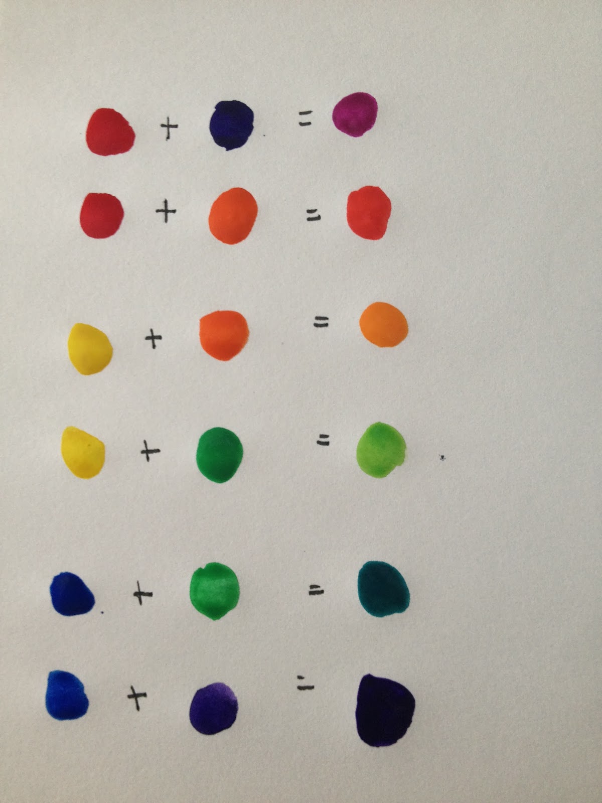
Mix your primaries together and you get secondaries.


Look at the happy color wheel! 
If you never did one of these in school you are missing out. 
This is the color-coordinators bible. Once you understand where 
these guys sit, you are ready to move forward.

Then you can add your primaries and your secondaries to get tertiaries. 
The color-math keeps going this way until you run out of colors. (I think a 24 bit RGB monitor can recreate something in the order of 16 million colors)
So now you can mix colors...

What about complementary colors?

Complementary colors sit across from each other on the color wheel. 
If you think of it as a clock face, 3 and 9 would be complementary. 
As would 12 and 6, 1 and 7, and so on. 
They are called complementary because they create a visual tension that we find pleasing. 
If you were to mix them you would wind up with brown.

This is a color wheel with primaries, secondaries, and tertiaries. 
Beneath the wheel is complementary color matches. 

Ready for some more? 
Using your color wheel isolate 3 colors that sit next to one another. 
This is called an analogous grouping. Once again this arrangement is visually pleasing.

By using three analogous colors, you can harmonize your pallet. 
Whether you are painting a still life or redecorating, 
understand color relationships can make your work sing.

We can talk a little about the meanings behind colors, but the meanings will change based upon cultures. 
All of the meanings I will share come from a Western European interpretation.

RED
Exciting, hot, passionate or danger, aggressive, violent

ORANGE
Fun, happy, child-like or loud and over-bearing

YELLOW
Joyful, lively, enlightening or hazardous or cowardly

GREEN
Fresh, trustworthy, prosperity, traditional, nature

BLUE
Calming, cool, peaceful, faithful*, dependable

PURPLE
Meditative, sensual, royal, dramatic, mysterious

BLACK
Powerful, elegant, mysterious, strong or death, mourning, and the underworld

White
Pure, clean, innocent, airy, ethereal, efficient or clinical, cold

GREY
Classic, timeless, neutral, logical, deliberate, and methodical


Next time you go shopping, or to eat, or anywhere pay attention to the colors. They are sending you a message! You can use the meanings behind colors to send your own messages in your home, wardrobe, and art work. 

What's your favorite color? Use that with it's complement and see what you think. Mine is BLUE so I would pair that with ORANGE. Not my favorite combination, but there is a reason so many universities use the blue-and-orange combo.

There are lots of little tricks that I like to use when doing art work or decorating. 
  1. Don't underestimate the power of a neutral color! I use tan, brown, and grey as neutrals as well as white.
  2. Contrast is your friend. It can be a little scary at first, but start small and work into it.
  3. Paint can always be painted over. I painted a brown accent wall in my dining room 3 years ago on a whim. I still love looking at it. I painted my kitchen a shade of yellow that has been burning my eyeballs this summer--time to repaint!
  4. Any color combination found in nature will ALWAYS work. Mother Nature is the ultimate designer!
  5. Ask small people what they think of your color choice. They will always be unabashedly honest.
  6. Make mistakes and learn from them
Now get out there and make color work for YOU!

*This is why brides carry "something blue" on their wedding day.

PS- there were a lot of references to eyeballs in this post. Completely unintentional.


Sunday, June 17, 2012

Watercolor workshop: Color!

Welcome back!
I LOVE COLOR. It is short of a miracle that I don't live in a house with each room done up like a paint-chip display at the hardware store. Don't you just love those? All of those colors arranged so harmoniously with each other!
Here's the thing about color: once you understand it, your whole life gets easier--and more colorful!

Colors are divided into groups:

Primary colors are your foundation. 
Red, Yellow, and Blue.
You can't MIX these--you have to buy them. 
If you have your primary colors plus Black and White, you can mix any other color.

Secondary colors are what you get when you mix your primaries.
Red + Yellow = Orange. 
Red + Blue = Violet. 
Blue + Yellow = Green. 
 If you have your primaries and your secondary colors you have a rainbow.

Tertiary colors are what happens when you mix a primary and a secondary. 
They are: red violet, blue violet, 
blue green, yellow green, 
yellow orange, red orange. 
Yes, the primary's name goes first--they're that important! 


You may remember the color wheel from your grade school days:


Complementary colors are opposites on the color wheel: Red and Green. Orange and Blue. Yellow and Violet. 
If you mix them together, you'll get a brown that is pretty close to black. 
But if you put them next to each other, it makes them pop! And will make your art (or your wardrobe) more vibrant.

Analogous colors are neighbors on the color wheel: 
Red-Orange-Yellow. 
Yellow-Blue-Green. 
Green-Blue-Violet. 
These colors will always look good together.

This week, you should make a color mixing chart! 
It will give you the full range of possibility that you have with your palette, plus get you used to working with your brushes.


Since I am working with a sixteen-color palette, I made my squares a half-inch. If you aren't as into rulers and measuring as I am,  go more free-form. 

The way this works is: 
Make a nine inch square. 
Measure off a 1 inch column* on the left and a 1 inch row on the top. 
Then measure off half-inch increments for columns and rows. Connect your measurement lines**, and voila! You have a grid. 

* Columns go up & down. Rows go left & right.
** I mark of measurements on the top & bottom of the page--and connect those. Then I mark off measurements on the left and right of the page and connect those.

For each column, write each of your colors at the top (in that one-inch space that we so cleverly left open)--until you run out.
For each row, write each of your colors on the left (in the one-inch space)--until you run out.

You should have a red on the top AND a red on the side, an orange on the top AND an orange on the side, etc.

Paint the color in each square that has that name. 
I did columns first. 
Above, you'll see a column of each color in the 16 color palette.
LET THE PAINT DRY.

Then paint across the rows with the corresponding color. 
You will paint OVER the squares you painted.

When you're done, it should look like this: 


Kind of fun, right? (Or not. Again, I LOVE color, so I get a kick out of having my own personalized paint chips)
Now you have a reference sheet for your palette! Oh, the possibilities!
You can pick any 4 color neighbors and they will always look good together.

Be aware of the colors that you are drawn to. Look in your wardrobe and see what colors you have the most of. Look around your space and see what colors you have chosen to bring into where you are. Jot down in your sketchbook/journal when you see color combinations that you really like.

Next week: techniques and tips!